Factors that make a smartphone popular among its consumers keep changing with time. There was a time when sleek and small phones were considered the best; whereas these days it is all about the size – the bigger, the better. There are some who go only for specs and features a smartphone offers while others believe in its outlook and weight. Phablets of Samsung are gathering positive reviews and generating a lot of sales despite the fact that the phone itself is too large to fit into a pocket. Still it manages to find a market for itself and generate great sales for the company.
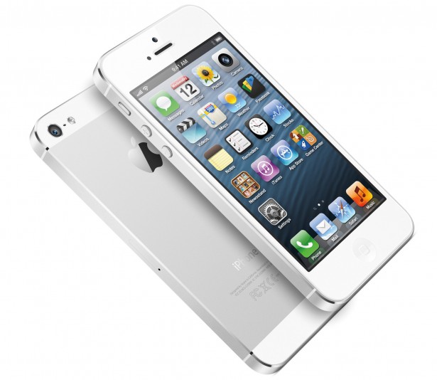
There is one name that has stood out among other brands in terms of consistency: Apple Inc. (NASDAQ:AAPL). There’s something about Apple that distinguishes it from companies all around the world. Apple smartphones have a signature look stands out from the rest; each model comes with different features, updates and specs, but the product design holds its identity. As opposed to Apple, Samsung has changed its shapes more times than we can count.

This factor is exactly what we will explore in this article, iPhone’s product design – a feature that often gets overlooked by an average user because of the great interest in the phone’s features.
Apple’s product design got attention when the first iPhone came out in 2007. Back then there wasn’t a very well defined concept of large touch screens. With pre-launch doubts and predictions about the possible success of the product, Apple Inc. came into the market and took it by a storm. One of the main reasons was its design – the 3.5 luxurious touch screen and the stylish build. The screen could withstand sunlight unlike other smartphones of that era. The phone managed to gather heavy sales and Steve Jobs knew he had unleashed a beast in the market.
From there on it was no turning back, Apple had made a name and engraved its impression on the market and in the heart and mind of the public. iPhone became the most anticipated smartphone every year after 2007. The features continued to grow but Apple retained more or less the same product design with only a few changes in the measurements. The build of iPhone became the persona of Apple. The heavy duty body reflected the vast world an iPhone held inside, the screen was large enough to watch videos and enjoy them and the camera quality grew with each model.
Apple has come a long way now with its first phone released almost 8 years ago. iPhone has taken giant steps since then and when iPad came it too had the same impact in term of its product design. The trademark design always gave Apple an edge because of their commitment to consistency and customer loyalty. The rest of the companies are still experimenting with designs and build, we don’t know whether they realize the fact that every change resets their customers’ loyalty.
Apple’s product design is an art itself; the hardware is built to support its features and specs with perfection. Employees at Apple University are taught about product designs using Picasso’s 11 lithographs, which shows how the company pays attention to design details that others fail to see.
Apple’s design superiority can be compared to that of Ferrari’s; people buy BMW’s and Audi’s, which may showcase more features and modern elements, but Ferrari’s class in design will always be in a league of its own.
There are many who think Apple Inc. (NASDAQ:AAPL) is of Ferrai or smartphones.


